purpose
as per this article on w3schools :
The media rule is used in media queries to apply different styles for different media types/devices
Media queries can be used to check many things, such as:
width and height of the viewport
width and height of the device
orientation (is the tablet/phone in landscape or portrait mode?)
resolution
printing, ...
example - width
common pitfall
in this first example, note that
either the default
bodyrule must come firstor the second rule must be more specific
the reason is that when the
@mediarule appliesthe browser sees TWO RULES for
bodyand if they have the same specificity, then the last one wins
so it is a good practice to use more specific rules in a media clause
hence ourhtml>body(for instance)
example - print
<link media=...>
another way to use media rules is to conditionnally apply a CSS <link> tag from the <head> node
<link rel="stylesheet"
<!-- NOTE the new media attribute here -->
media="screen and (min-width: 900px)"
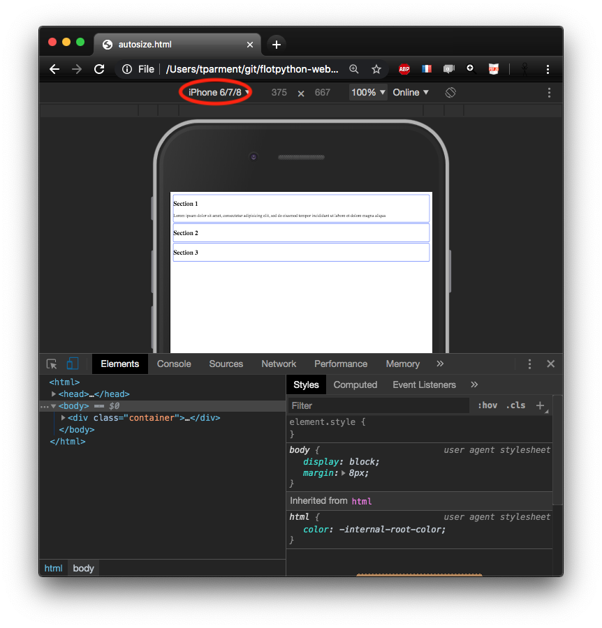
href="widescreen.css">devel tools and multi-device
the devel tools - on chrome at least allow to simulate other devices - like popular phones and tablets
see also
this w3schools page has more details on the admissible syntax for media rules
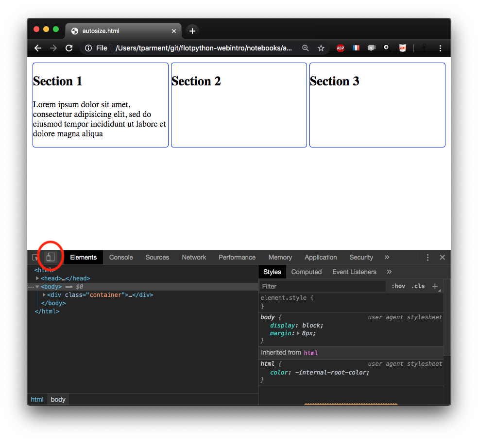
practice - responsive grid
open the example below in a separate window
and observe behaviour on narrow, mid-size, and large viewportwrite an HTML document and related CSS that mimicks it
at least for viewports smaller and larger than 512px