responsive, meaning ?
as opposed to a Word document - designed for a fixed page size
a web page gets displayed on many different devices (computer, phone, tablet)
even on the computer, windows can be resized arbitrarily
a responsive page adapts its layout to the device size
technically the visible area is called the viewport
and also to the nature of the device (e.g. screen vs print)
this means that for example, we want to obtain different layouts for the same content, depending on the screen size

the same content seen through different viewport geometries
default layout policy
if you do not override the
display:property, you use a historical layout policyvery well summarized in this document on MDN (MDN = Mozilla Developer Network)
mostly fits a written document flow (think, a Word document)
not at all suited for a responsive design
display property : basic policies
layout policy is primarily materialized in the
displaypropertyits value can be
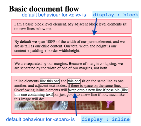
display: inline- this is the default for<span>display: block- this is the default for<div>
these account for these legacy “document-oriented” policies
that have been supported from the very beginning of the Webwell illustrated on this page on css-tricks.com
display - modern alternatives
good news is, there are more modern values, especially designed for responsive layouts:
display: grid(2-dimensional) like the name suggests,
allows to define a rectangular area as an array of rows and columnsdisplay: flex(1-dimensional) a flexible layout,
with more control on how children will fill the available space
we will study these 2 policies in the following notebooks
display: none
ther’s also a special value worth mentioning here:
one specific value is
display: nonein that case the element is still present in the DOM
but it won’t show up at all in the rendered page
very often used in JavaScript to temporarily hide/show elements (more on JS later)